Colour
Lithography
In
both its flat tints and chalky line lithography
lends itself to colour printing and Senefelder
made efforts to introduce it by using a
second stone for a coloured tint, a practice
perfected by the German lithographers Strixner
and Piloty about 1808-10.

Richard
Parkes Bonington (1802-1828):
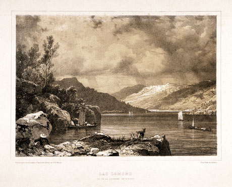
"Lac Lomond - vu de la Caverne de Rob Roy"
From: 'Vues Pittoresques de l'Ecosse'. Tinted
lithograph, 1826.
Printed from three stones in black,
beige and white.
(168 x 287 mm)
Tinted
lithography became popular from the late
1820’s,
particularly in England, as a method of
reproducing tinted drawings. The tint stone
was painted with greasy wash all over except
for areas of ‘white’ highlight.
Usually it was printed in cream or buff.
The white highlights were those unprinted
areas where the natural colour of the paper
showed through. The principal stone with
the drawing was printed in black over the
tint. Sometimes a second ‘blue’ tint
stone was added for the sky (tinted lithography
was largely used to reproduce drawings
of landscape).
Attempts
at full colour lithography from multiple
stones were made in the early 1820’s
but the principle of colour printing from
four stones in the three primary colours
and black (an adaptation to lithography
of the principle of Le Blon) was only patented
in 1837 by Godfrey Englemann, who had been
a pupil of Senefelder and opened a lithographic
printing works in Paris. Englemann developed
the technique as a means of reproducing
coloured images, rather than as an artist’s
original means of expression.
More
important for the future artistic development
of colour lithography was the work of the
English printer Charles Joseph Hullmandel
(1789-1850), who independently at the same
period developed chromolithography as an
extension of tinted lithography by hugely
increasing the number of tint stones employed.
He used a different stone for each printed
colour, rather than relying on overprinting
and optical mix of the four-colour technique.

Thomas
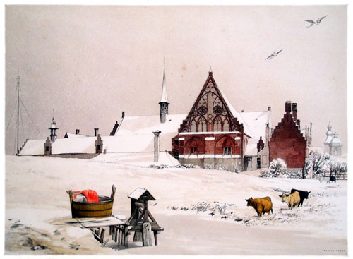
Shotter Boys (1803–1874): "Byloke,
Ghent".
Colour lithograph, 1839
Printed from multiple stones. (269
x 370 mm)
One
of Boys’ scenes of “Picturesque
Architecture in Paris, Ghent, Antwerp,
Rouen etc.” . Other subjects from this
series are included in a dedicated
web exhibition, soon to be featured here.
Hullmandel
developed new translucent inks to achieve
local colour and tonal variation. Though
Hullmadel’s technique too was
largely directed towards translating designs
first conceived in watercolour, his pioneering
work in collaboration with the artist Thomas
Shotter Boys resulted in the first artist’s
original lithographs printed in colours (see
illustration above). These were published
in a portfolio in 1839 with the title Picturesque
Architecture in Paris, Ghent, Antwerp, Rouen,
etc. A web exhibition, featuring the
majority of the prints from the series, will
soon be featured on this website.
It
was only at the end of the century, after
the revelation of Japanese colour prints,
that artists again got excited about making
images printed in colour. The colour lithographic
posters of Cheret in the 1880’s anticipated
an effloresence of lithographic colour
in the 1890’s, the decade dominated
by Toulouse-Lautrec, in both posters and
colour prints, and culminates in the colour
lithographs of Renoir and the intimiste
Nabis, Bonnard and Vuillard, encouraged
by the publisher Ambroise Vollard.
In
England, despite the early interest
evinced by Shotter Boys, colour
was much slower in becoming a means of
original artistic expression in lithography.
In the first decade of the 20th century
John Copley made some interesting colour
lithographs (see illustration top right),
but his later work in the medium was black
and white. Much later in the century, artists
such as Terry Frost (see illustration
above right) recognized the potential
of brilliant colours in conjunction with
free drawing which lithography allows to
create abstract prints. |